New app that increased couriers' productivity by 20%, saving 1h of work time
Overview
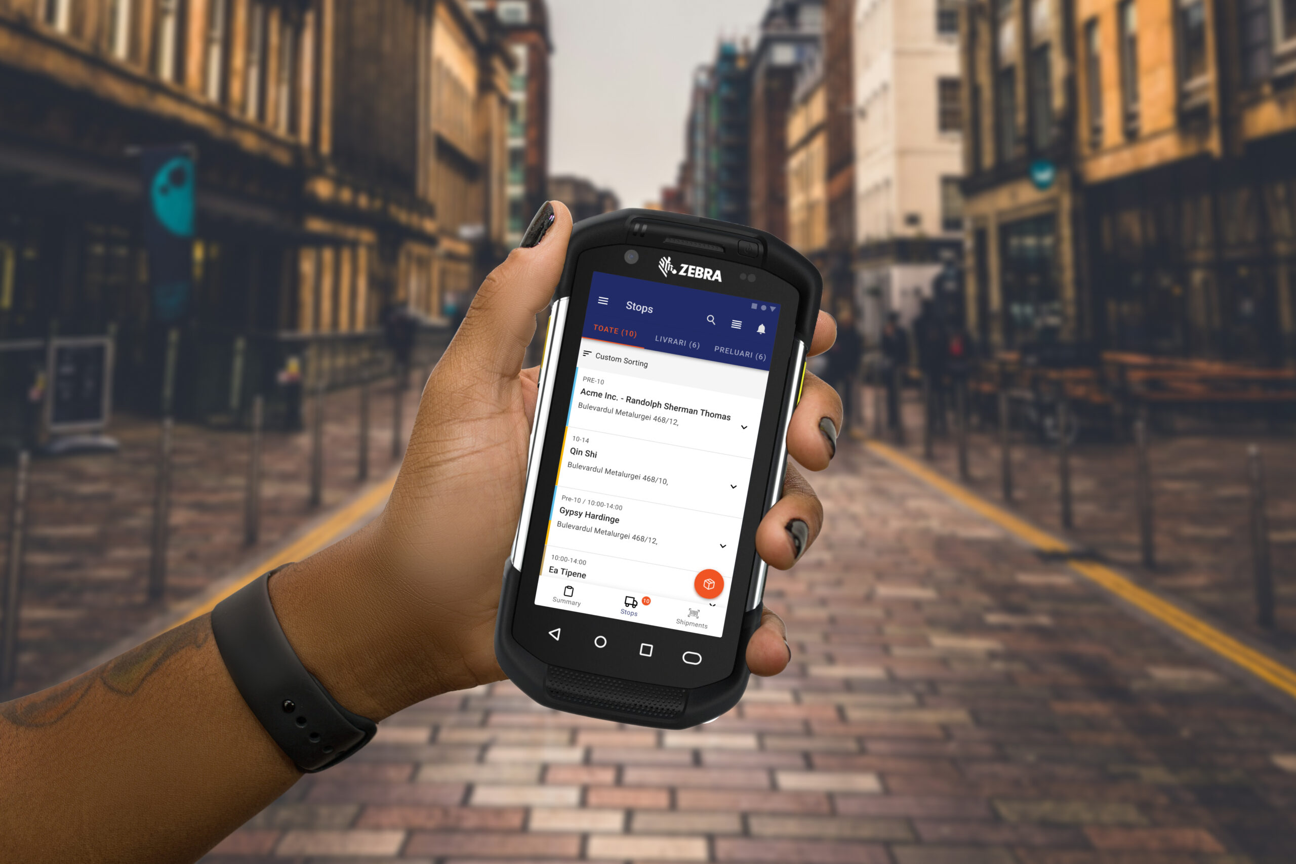
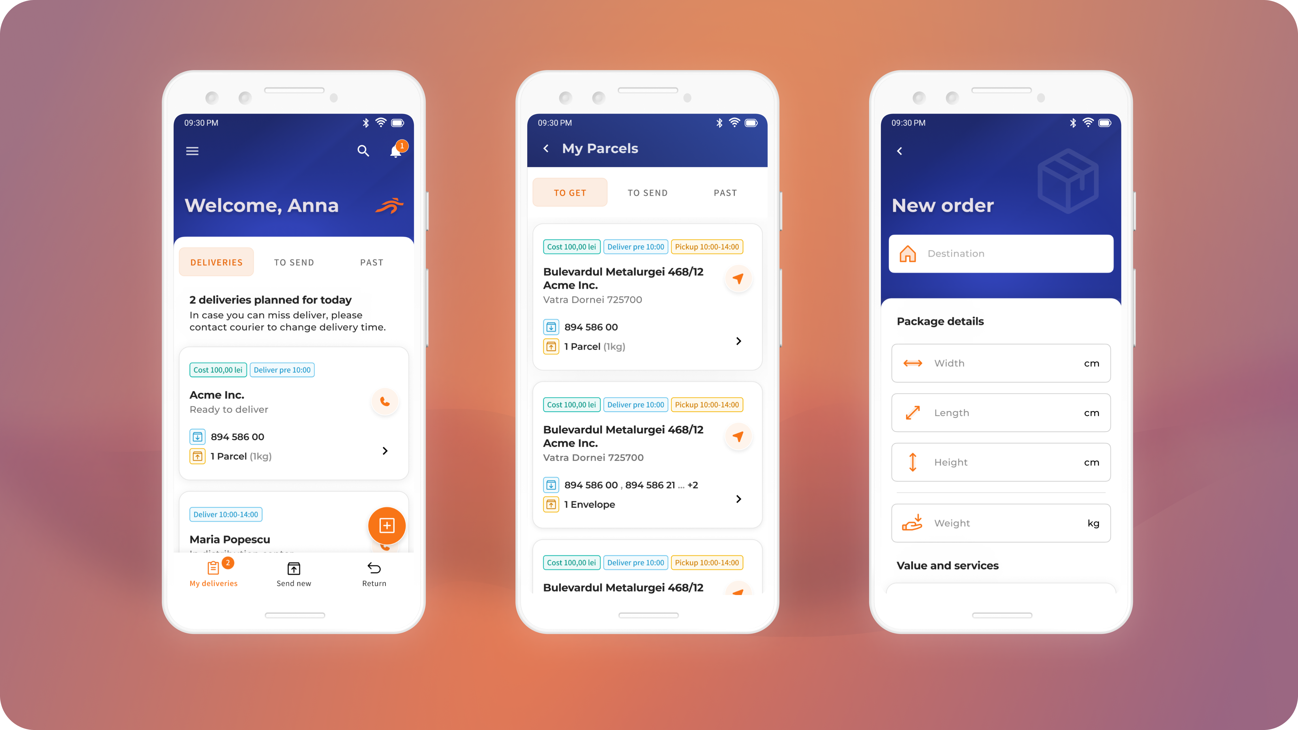
The new mobile platform for delivery company helped in improving operational processes and transfering activities to the new devices. It started with an intense business analysis to define the product direction that resulted in an MVP addressing and simplifing crucial journeys of core employees and created space to introduing next features planned on the roadmap.
My Contribution
• Leading the team of analysts
• UX research Mentoring of client PMs
• Design of the whole app
• Collaboration with devs
My Role
• Couriers saved 1 hour of daily work time
• 20% improvement in volume parcels processed
• 10% time saved on planning routes
Platforms
Android
Year
2020
Problem
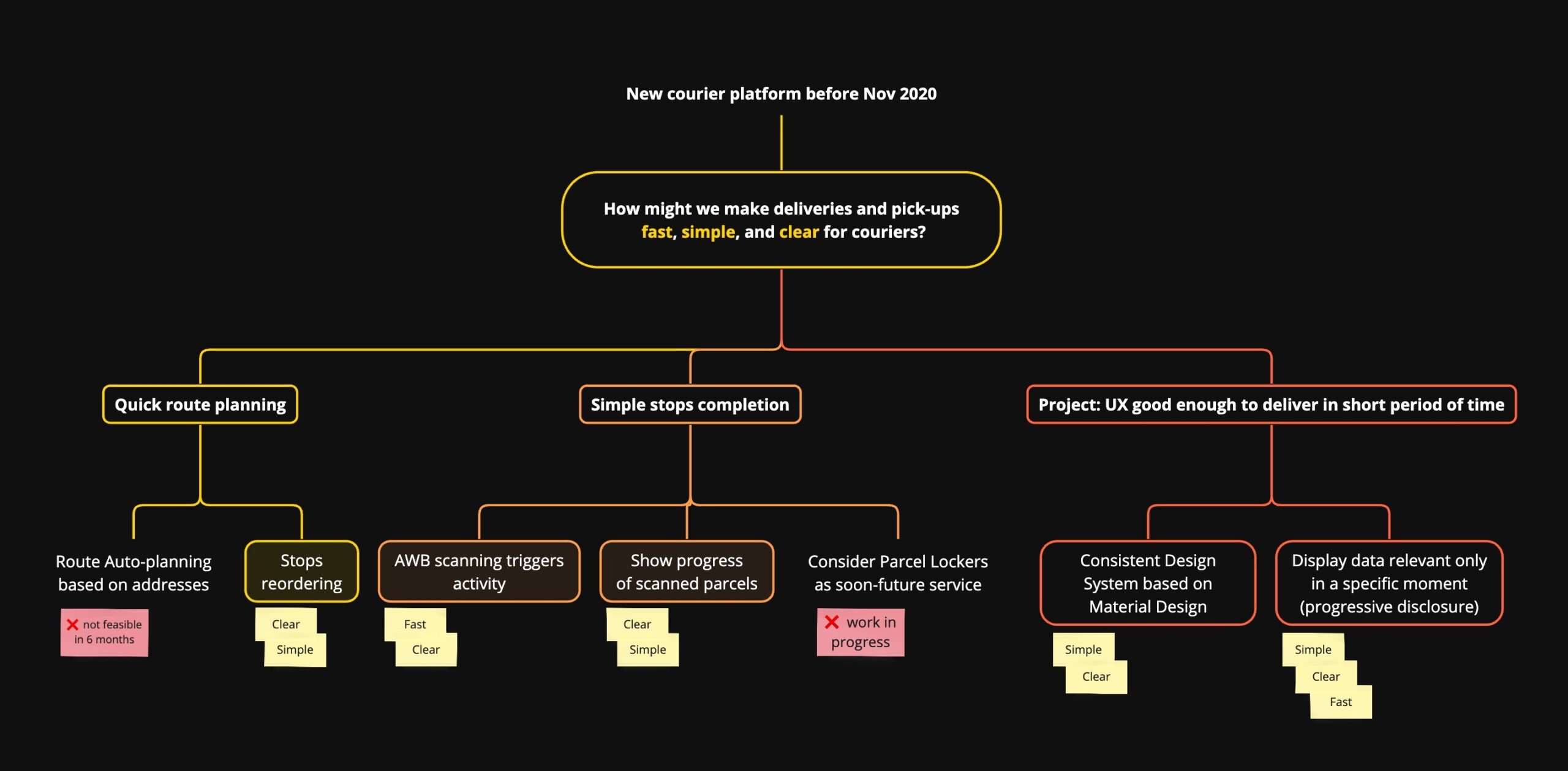
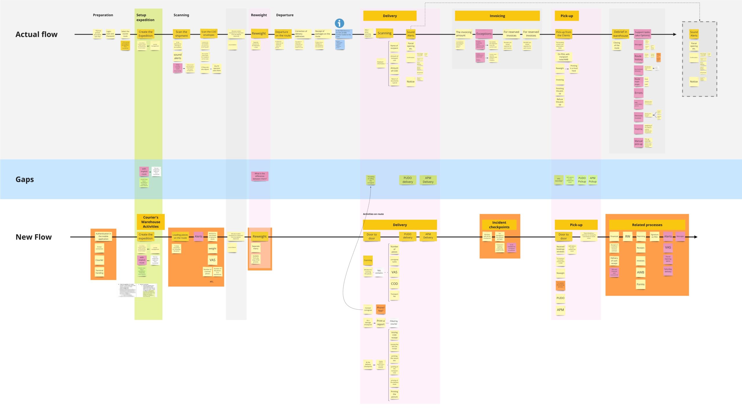
Urgent Cargus faced the end of support for their couriers' PDAs. This gave them an opportunity to refine their processes and create new solution that could help delivery teams work better. To get this right, I organised a workshop on which we sythesized 3 key problems linked to the current solution.
1. New generation of users
Any new courier joining the company couldn’t use the app without reading a long and dull pdf guide.
2. Obsolete App
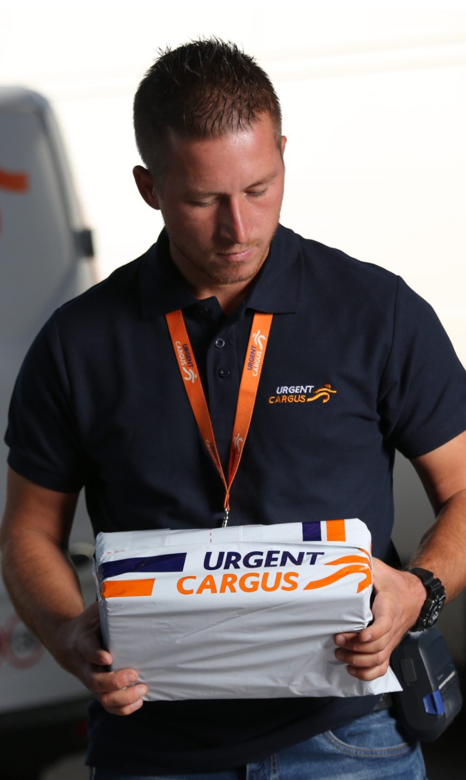
Couriers complained for years about the PDA's app usability for pick-ups and deliveries.
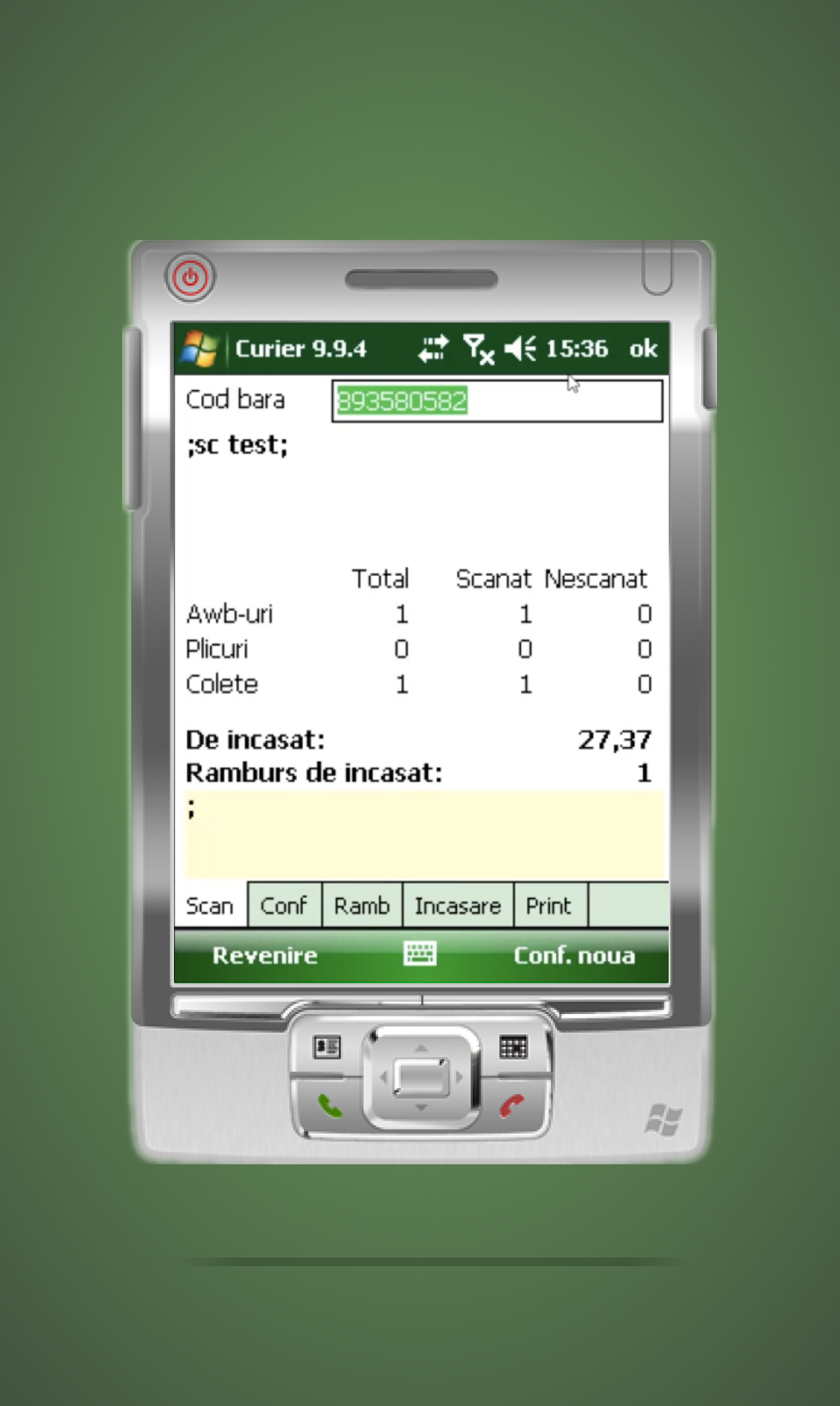
3. Inconsistent user flows
User flows were inconsistent, forcing users to go back and forth between screens in order to complete activities.
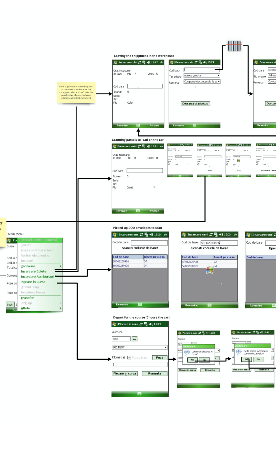
That sparked an idea in our mind that I framed into a challenge:
How might we make deliveries and pick-ups fast, simple, and clear for couriers?
Waypoints, not parcels
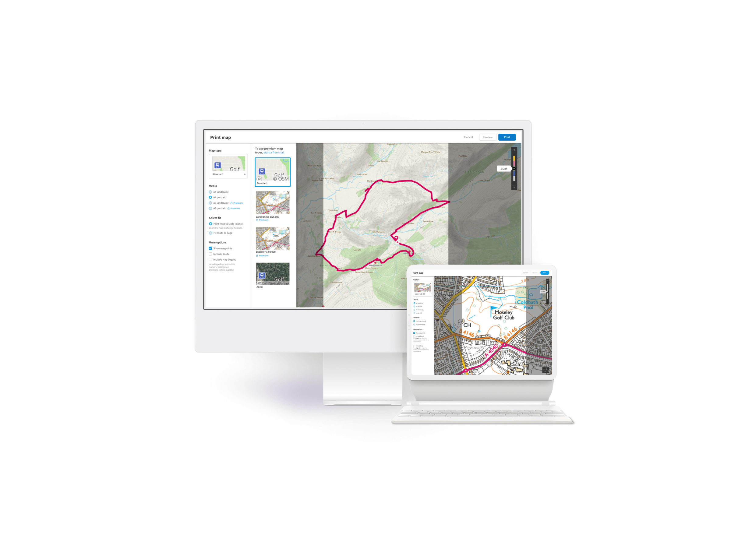
Couriers had to read addresses from each parcel to plan their daily routes. This step held people from starting their meaningful part of the job. The solution had to help couriers in faster route planning, best if automated.
Device as a Parcel Assistant
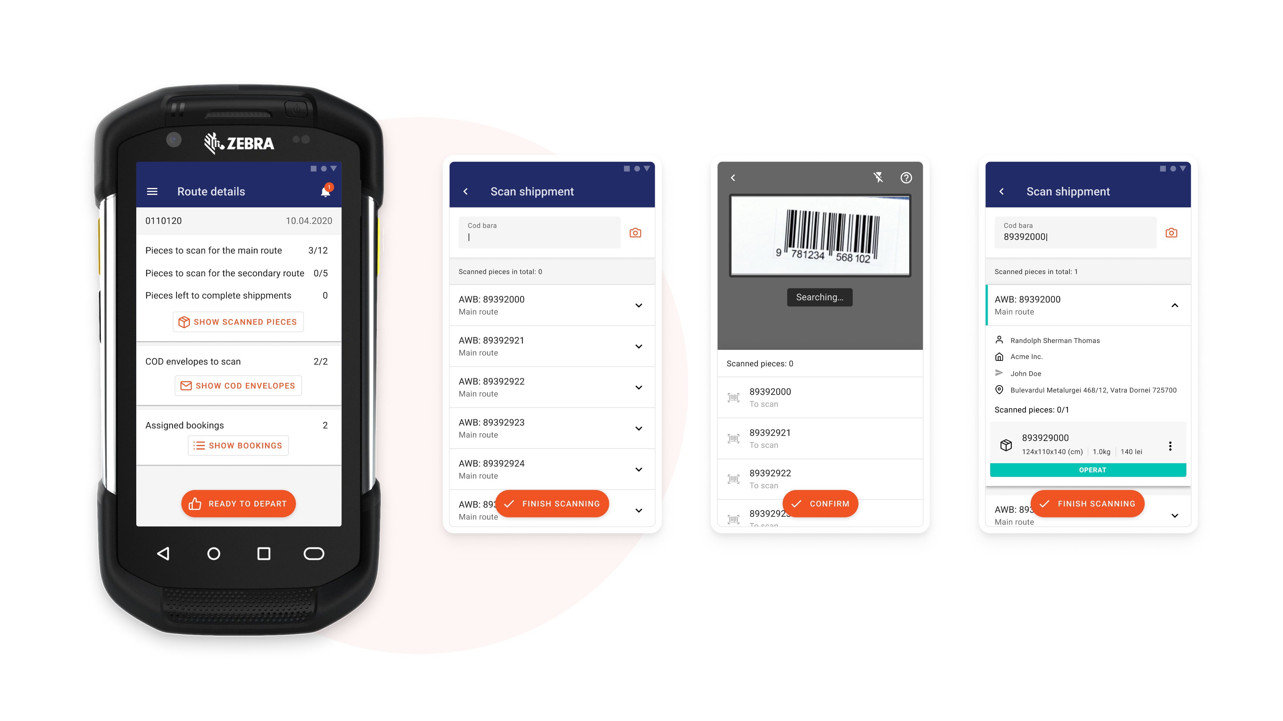
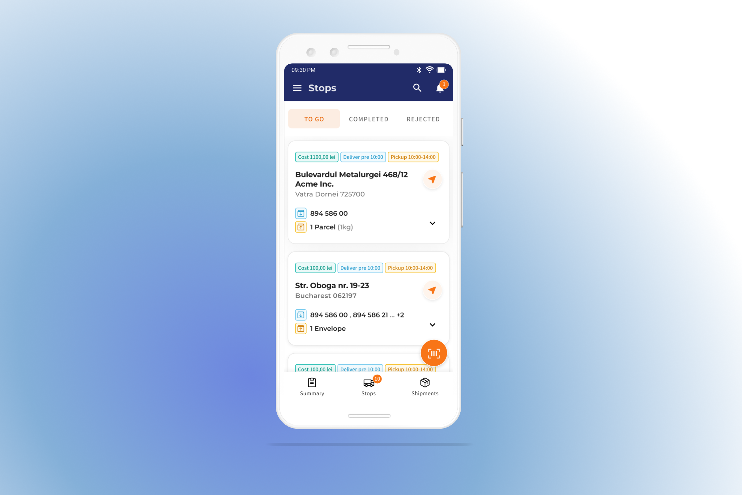
App didn't show enough information to plan pickups and deliveries. Information about the number of parcels to take was shown only when scanning a printed AWB. New solution had to inform about this before reaching the target waypoint.
Design: Simple and shared
Design and development time were uncomfortably short. The time was short to design app when the company process were redefined. This meant we decided to base on simple components that focuses on functionality and scalability. Next step on the roadmap was a whole company rebranding that would also impact internal products.
Research & Design
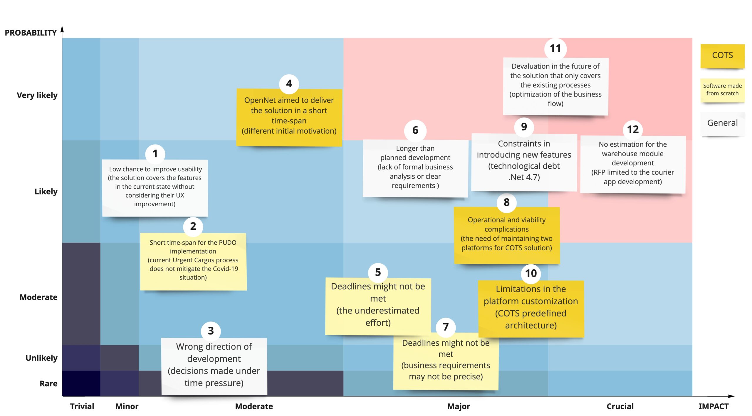
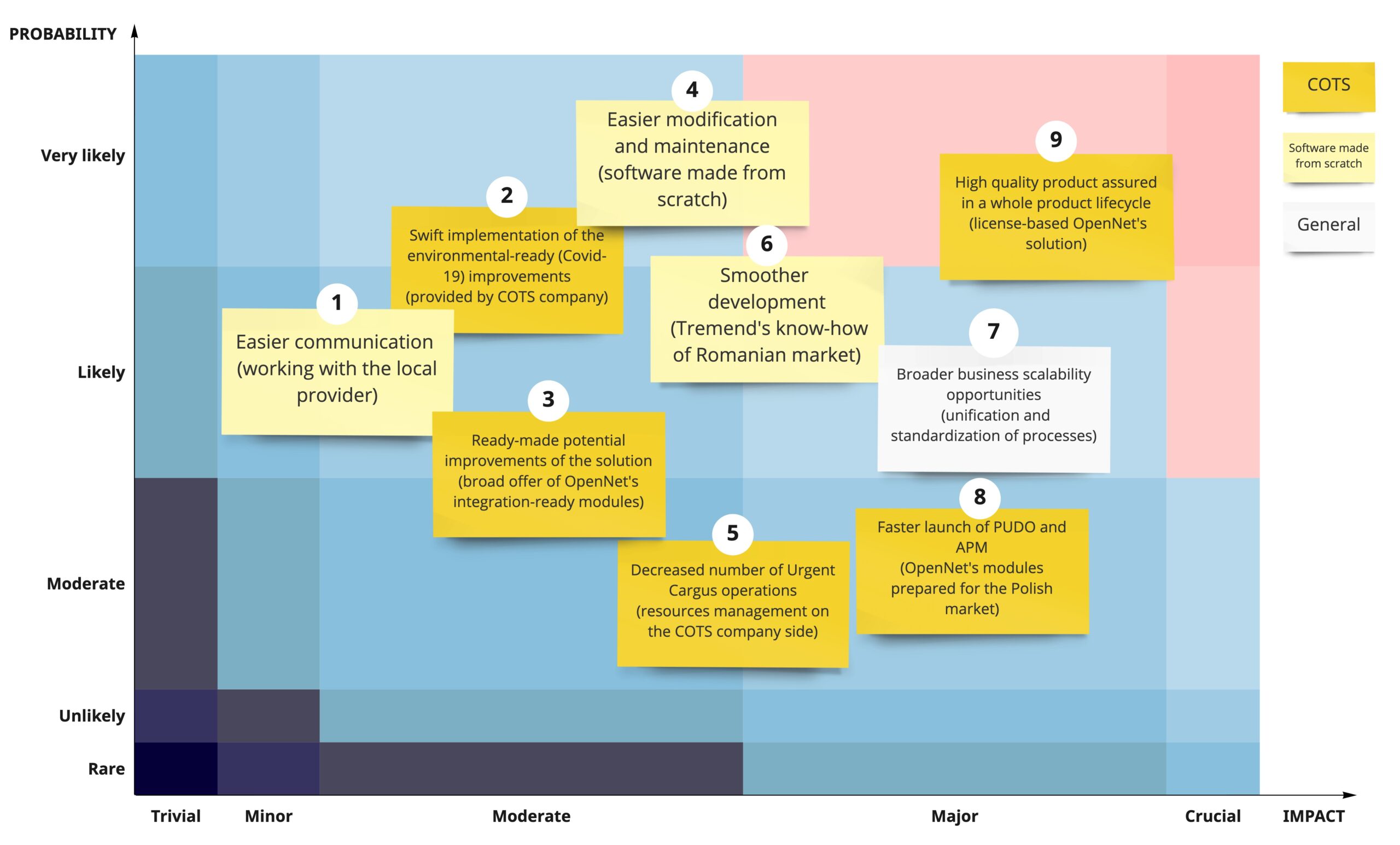
Analysis: building a custom app or integrating COTS?
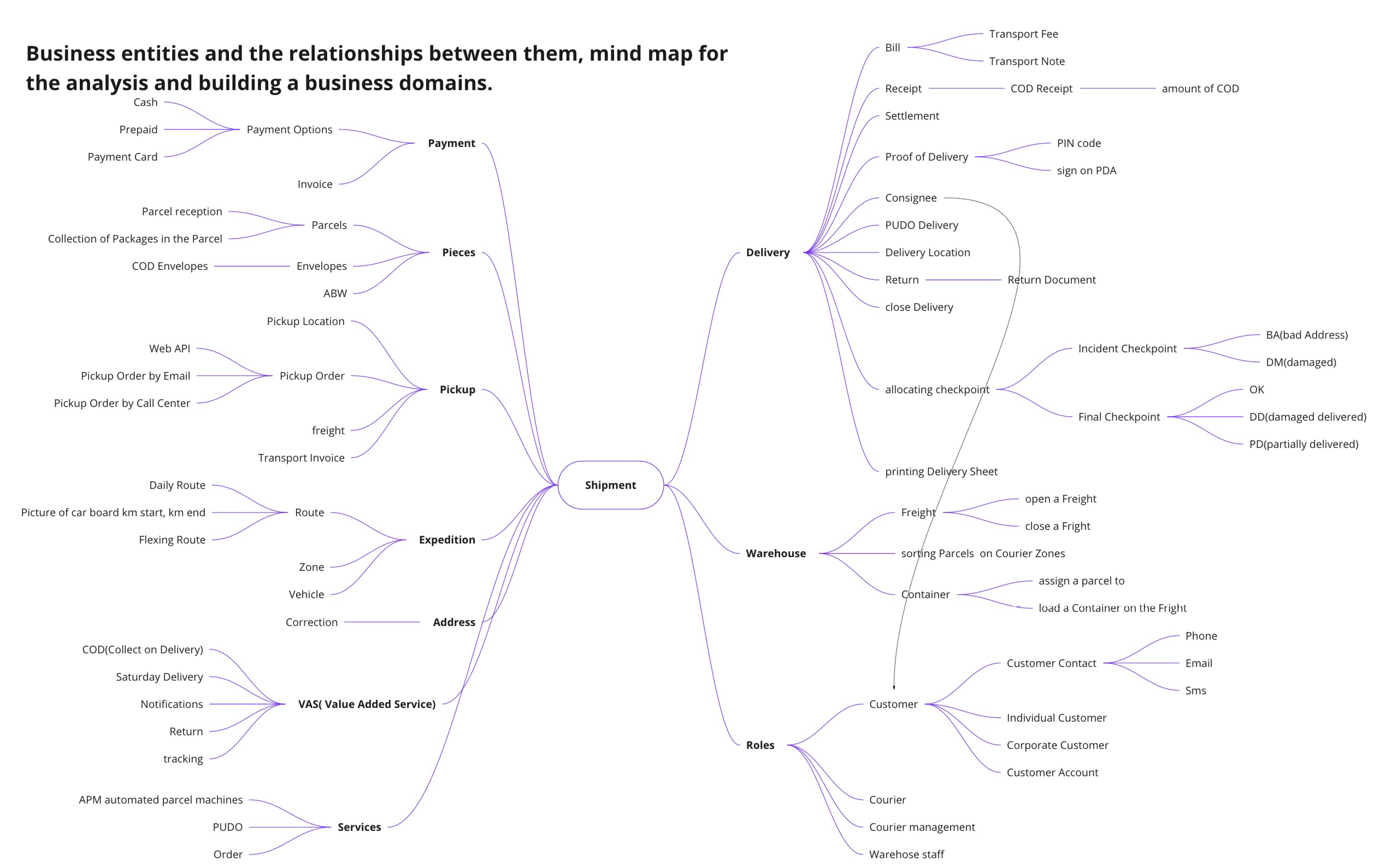
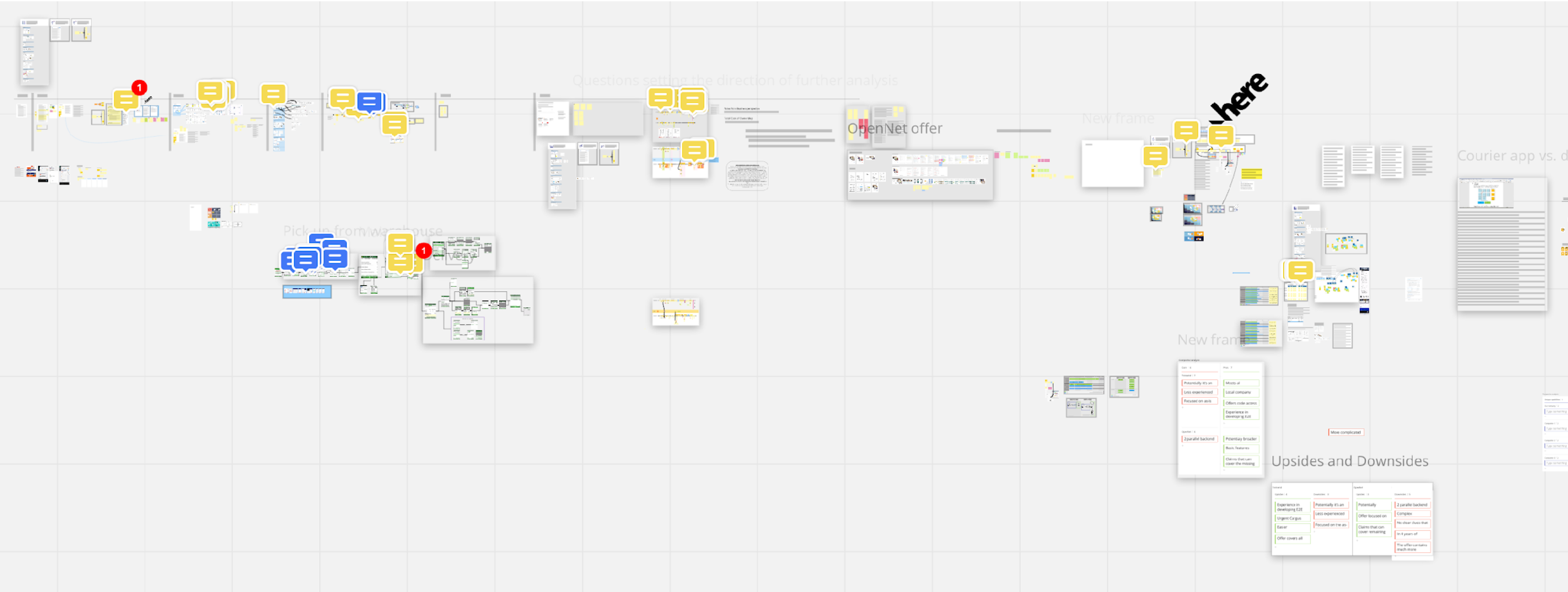
Understanding "what we have", "what we want", and "what we miss right now" was a crucial part of investigating if the new solution should be bought and integrated, or built from scratch. Analysis was also done with company SMEs that shared key details (that were not known by key decision-makers before).
This the end?
Further exploration
As the development of the MVP worked at full speed, I used the time left to plan the next steps. The testing phase confirmed our hypothesis that couriers skim the screen and jump between stops to choose the next destination. Because of hectic workflow, they can rarely read all the details at first sight.
The situation created the opportunity to adjust the visual hierarchy in the design. The current branding at the time was quite difficult to operate but still, I managed to draw a new proposition to showcase how UI could be simplified. Simple visual elements would guide the user's attention more efficiently.
Heavy branding was planned to be refreshed
We have learnt soon that the company planned the creation of a new app for customers too. This project and implementing improvements for the existing platform could be aligned.
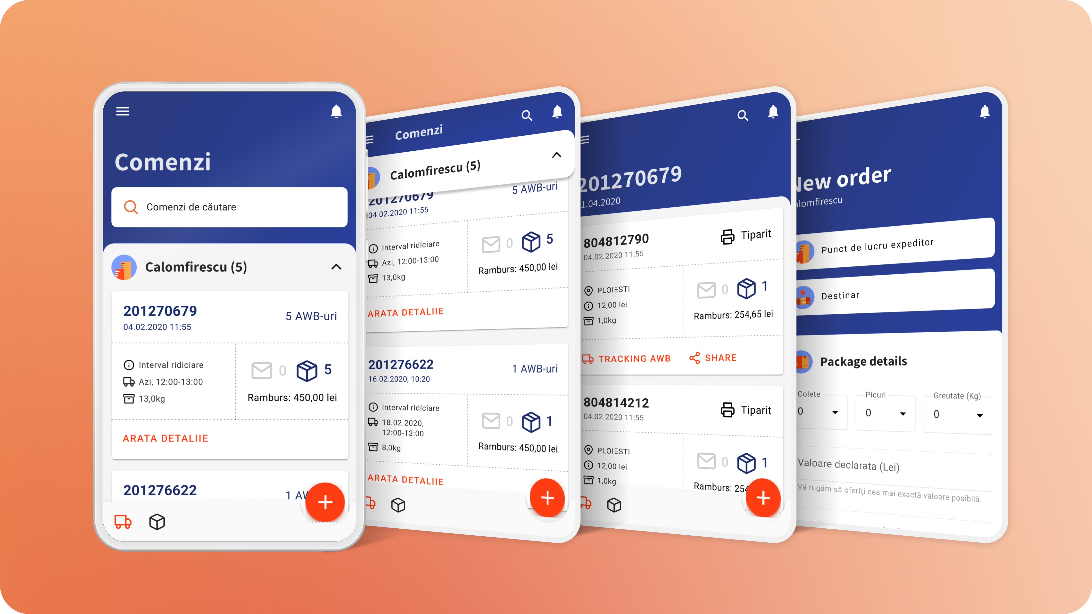
The foundation for both could be a new design system with an updated look and feel. The MVP solution was based on generic Material Design elements. It helped in the quick development of the solution but it wouldn’t be scalable and cost-efficient in the longer run.
The new design system would leverage the further development of the Urgent Cargus platforms. The company has thought about rebranding for some time, so the space for proposing new visual solutions was quite broad.
The Final Adjustments (for then)
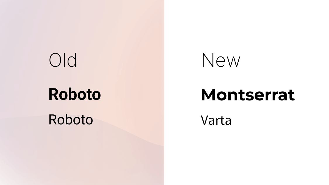
Typography first
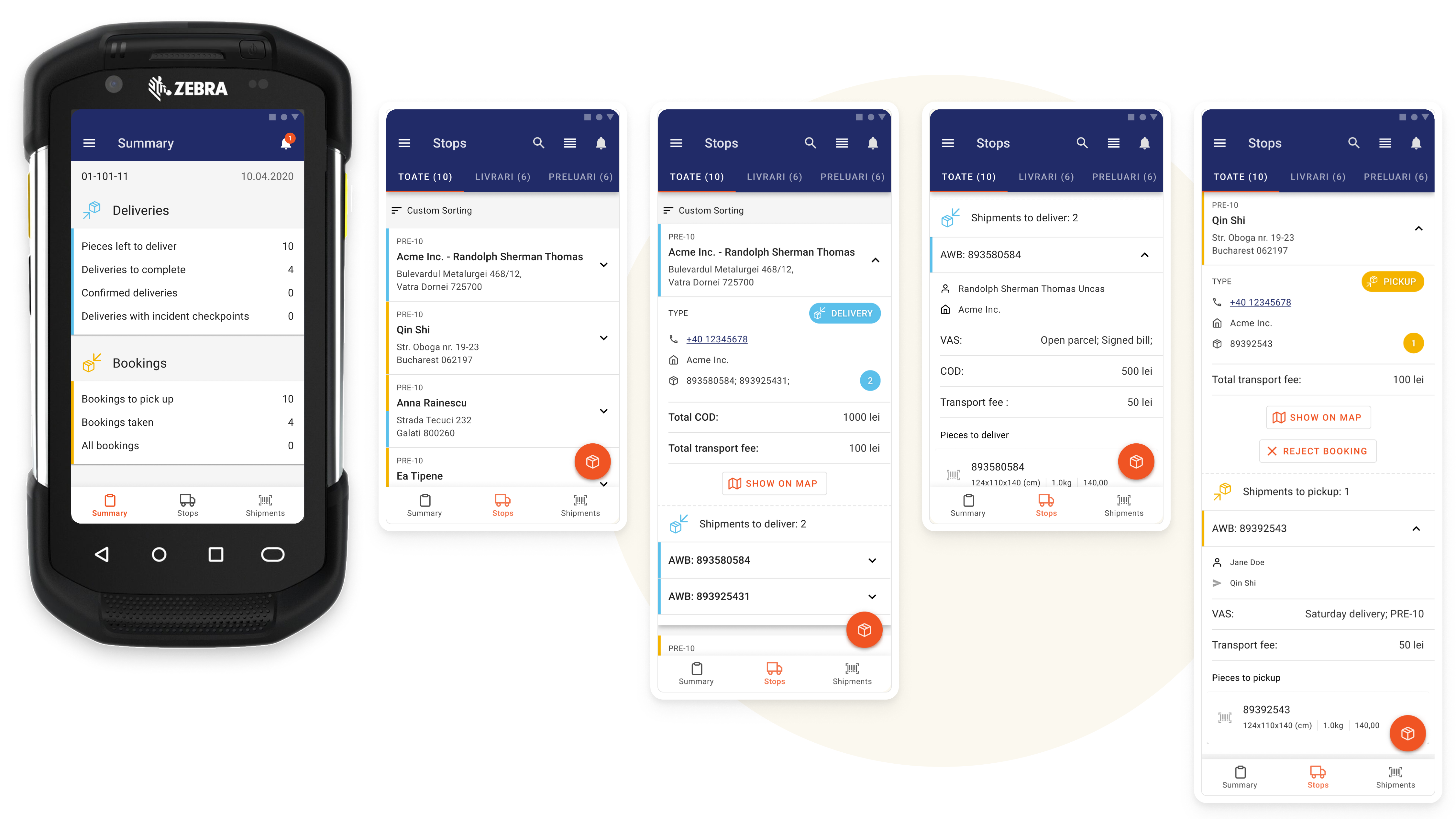
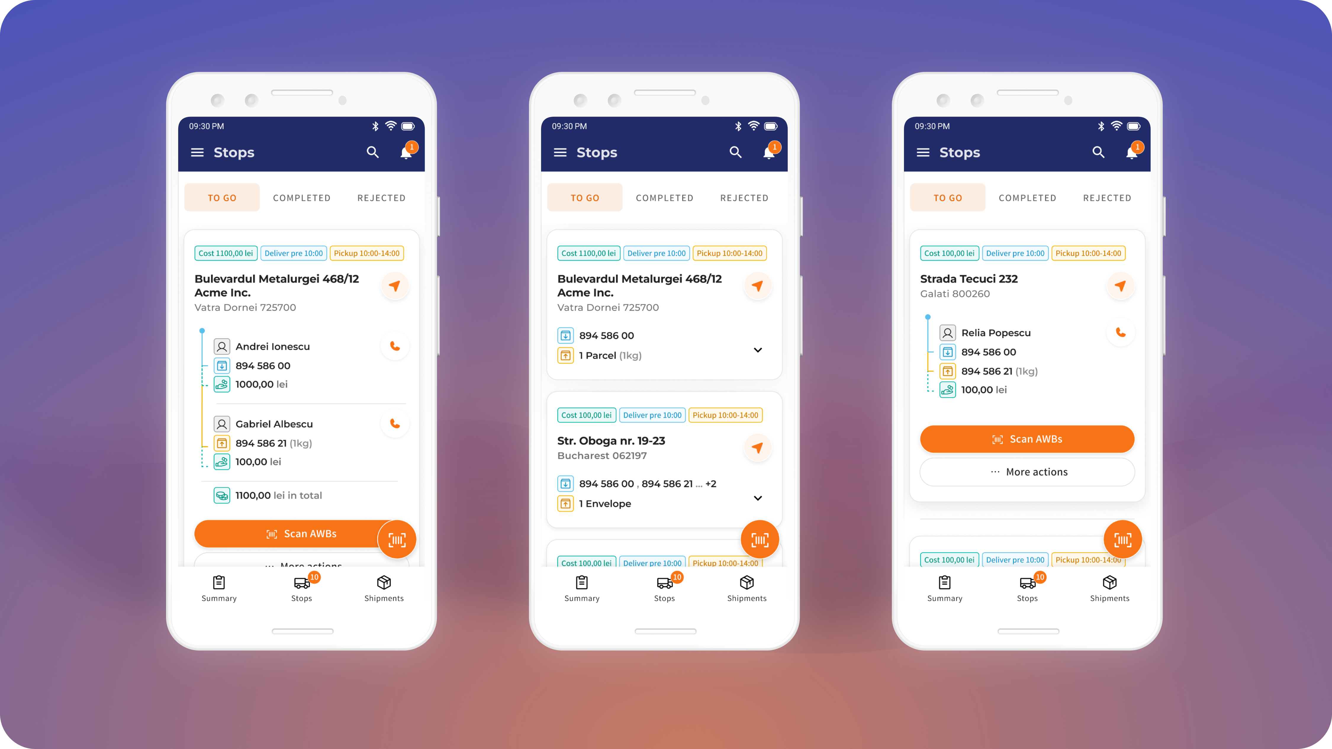
In the new concept, we introduced new typography that would break the Android-generic look of the app. Strong headlines will help couriers navigate the app, while narrower body text style will fit in small areas while still being readable.
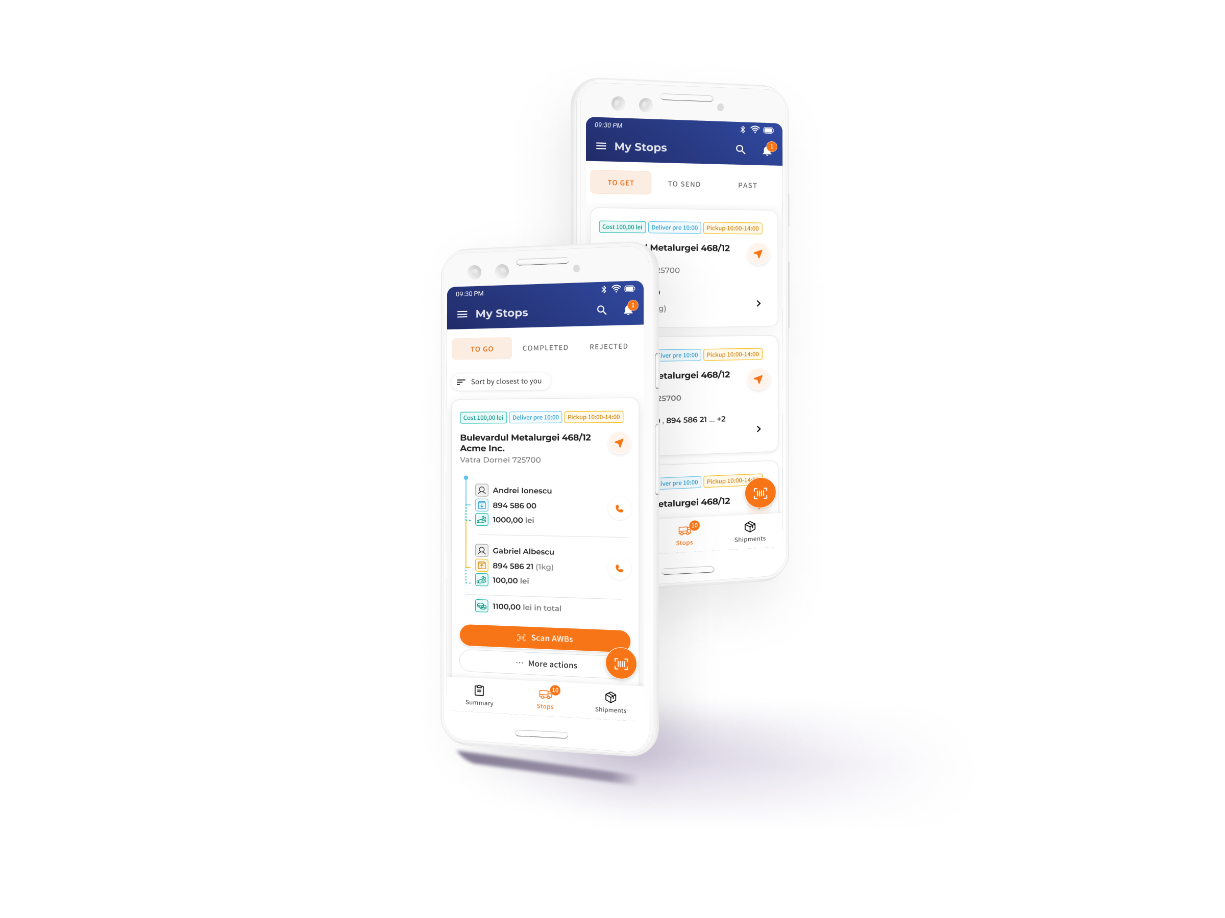
Expandable stops got better and clearer
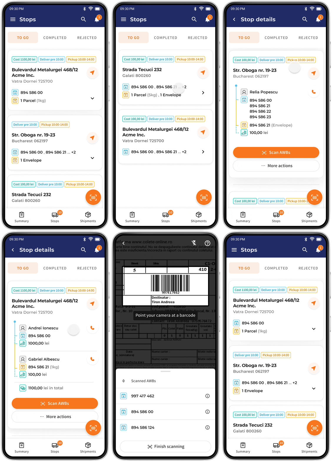
Stops view uses the same cards view layout. However, opening one stop shows all the necessary details. Labels disappeared. Why? What we've learnt on tests – couriers must identify just a couple of information bits - mostly address, Consignee name, AWB number, and payment amount. Icons would do the work.
Results
Couriers started working with the new platform 1 month before Black Friday. This time left let us perform adjustments while getting feedback from couriers and their supervisors. The designed showcase of the next iteration was presented but my involvement in the collaboration had to end due to other obligations. However, it was fun to work on it. I could show how and why apps can work and look great not only for customers but for operational teams as well.
A couple of months later, we got feedback about the process improvements that the MVP app introduced. They were later presented in the press materials.
Key Improvements
1 hour
+20%
+10%
Time saved by couriers every day
The volume of parcels possible to deliver at the same time
Time saved on planning routes
Press
Last year, for example, the volume went up 20% and the pace is the same this year. Equipping our couriers with Personal Digital Assistant devices responds to these needs, by simplifying processes to the benefit of couriers and clients alike. (…)
(…) the delivery process will be significantly simplified, couriers performing all operations in a single point of contact: from calling and texting the client to mapping routes and signing off digitally. This simplification will be reflected in couriers’ productivity, which is set to go up 10% on each route, but also in the time spent by them on deliveries, as they would save approximately one hour per day, according to the company’s estimates.
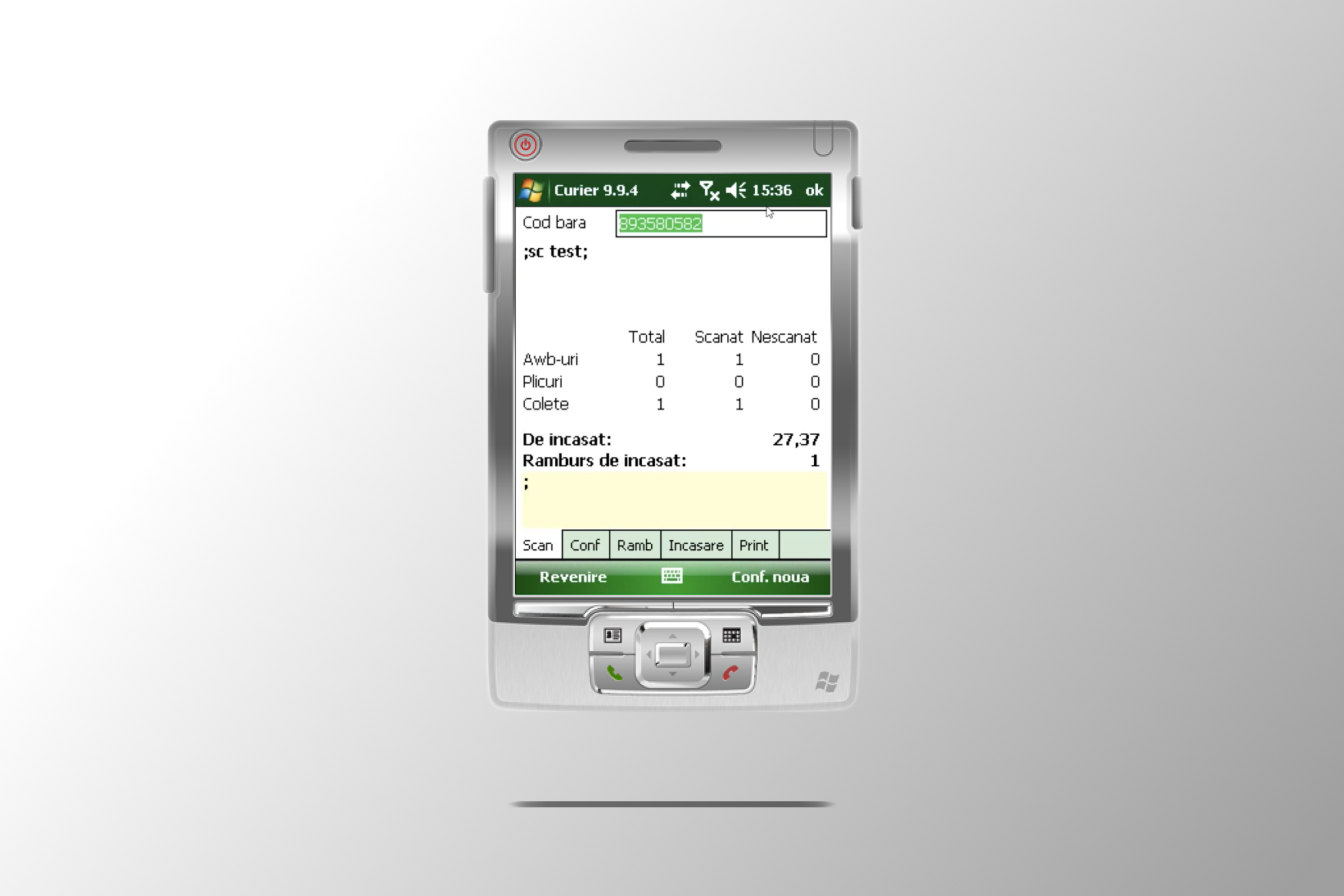
Comaprison Before-After
My work
Contact
Krystian Polański
krystian.polanski.design@gmail.com
© Krystian Polanski 2023
